This month, the staff at Scribendi had the pleasure of unveiling the redesigned Scribendi website. This is a big step forward for Scribendi and encapsulates years of work and effort from every department. The new website is modern, clean, and designed with our clients in mind.
Here are some of the things we think you'll find most useful:
- Chat widget: You can now instantly chat with a customer service representative and get answers to your most pressing questions.
- Simplified service categories: Finding the right service for you will be easier than ever with our streamlined navigation.
- Intuitive layout: Our new layout makes it easy to find exactly what you are looking for, as our services, resources, and employment opportunities are easily accessible.
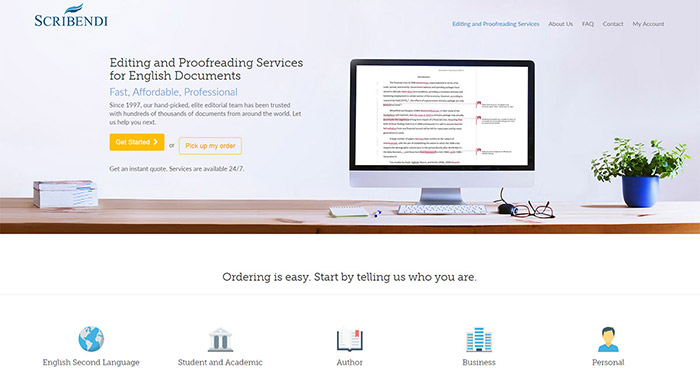
Because our new website also marks Scribendi's 20th year in business, we thought it would be interesting to look back at where we started and fully appreciate the strides we have made in the past two decades.
Scribendi's Origins
Scribendi began in 1997, when our founder, Chandra Clarke, saw a need for convenient editing services. She had been working as a journalist at a local newspaper and wanted to come up with a solution to the errors that can so easily slip through.
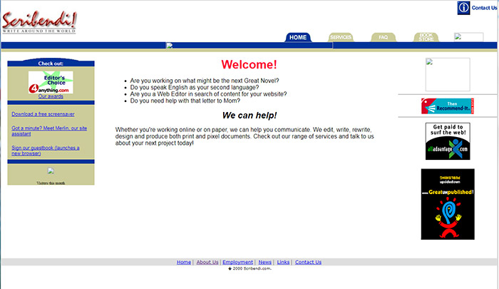
She created Scribendi to fulfill that need. Our first website went live in January of 1998, and Scribendi entered the world of online editing and proofreading. In fact, we were the first online editing service to receive ISO certification (which means we adhere to the quality requirements of the International Standards Organization).
Here's a screenshot of our very first website, which also featured a different Scribendi logo. Web design has certainly changed a lot over the last 20 years!
Scribendi began as a home business, operating from the basement of Chandra's house. In 2003, Chandra's husband, Terry Johnson, joined the management team as Vice President. Together, they have helped Scribendi grow into the sustainable, award-winning company it is today. You can see in this photograph of the family that, at this point, only three out of their four children were born.
The company expanded rapidly, and we moved to a dedicated office space in 2005.

Scribendi's Web Evolution
When you compare Scribendi's first website to its newly unveiled one, it's clear that Scribendi has grown and evolved over the years. While it's important for any business to accept change, it is even more imperative for online companies, as the world of technology moves very quickly. As such, we have updated our website multiple times to accommodate advances in technology, changes in design best practices, and a growing workforce. Take a look at our homepage from our second website:
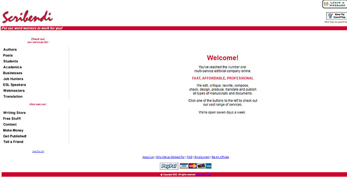
We launched this website in 2003. As you can see, we embraced a red color scheme and added more tabs to make the site easier to navigate. This website served us well until 2005, when we decided to revamp it again:
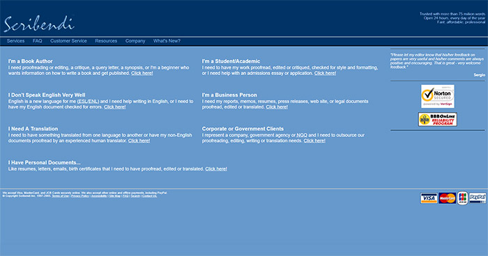
This year marked some major changes. We traded red for blue, and we placed all our services right on the home page. Over the next five years, Scribendi continued to grow, and we edited our 100,000th order in 2010.
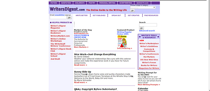
Many of our readers probably don't remember, but this website was a premium design. Don't believe us? Take a look at the Writer's Digest website from the same year:
The next Scribendi homepage might look familiar to you, as it served us from 2011 until 2017, in various forms:
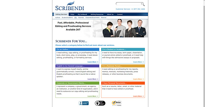
In 2011, we updated the Scribendi logo and settled on the dark blue color. Its design was reliable and straightforward. We also introduced color-coded service pages to make navigation easier.
Scribendi in 2017
Although our old website treated us well, it was time for a facelift, which brought about our new website design. Take a look at this comparison of our old and new homepages:
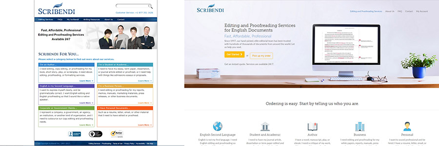
The responsive design of the new website will make it easier to view the site on any screen size, from large desktops to small mobile devices.
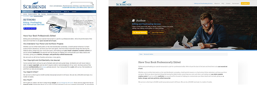
We also updated all our service pages, incorporating large, aesthetically pleasing visuals, more white space around paragraphs, and easily visible ordering buttons to help you find what you need quickly and easily.
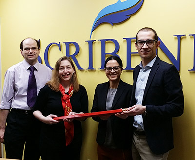
However, a new website isn't the only change Scribendi has experienced this year. In January of 2017, Scribendi was acquired by Enrico Magnani and Patricia Riopel of MAGNUM Capital Partners.
The two entrepreneurs relocated to Chatham, Ontario, from Montreal, Quebec, to take over operations, and they were instrumental in the completion of the new website.
Below, you can see Terry Johnson and Chandra Clarke (left in image) passing over the Scribendi pencil to Patricia Riopel and Enrico Magnani (right), Scribendi's new President and CEO, respectively.
This has been an exciting year, and we are looking forward to much more excitement in the next 20 years! Our customers should expect more improvements in the coming months that will make using Scribendi even more convenient and easy. You can keep up with these changes on Facebook and Twitter!

